
Part Six: Inks & Letters
Explore the Inking & Lettering stage of The Last Abraxan. Where textures, lighting and details get defined.

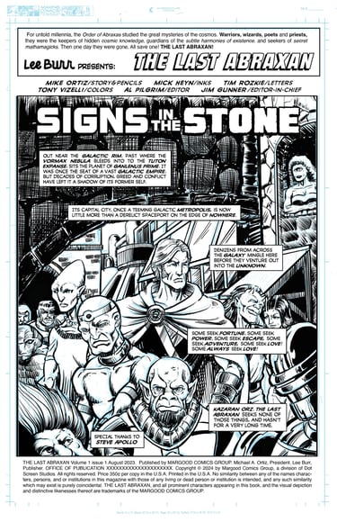
With the pencils done, it was time to focus on the actual script. I had been working out a basic script in my mind as I laid out and drew the book, but now it was time to finalize it. I wanted to use narrative captions and thought balloons, which were common at the time, and even use them to add a bit of backstory and texture to the world. I aimed for the exaggerated comic book language of the era, with a healthy dose of hyperbole and overwriting.
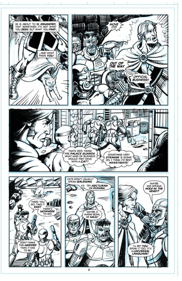
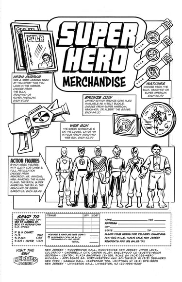
To give it an even more old-fashioned feel, I decided to letter the book before inking it, so I wouldn’t have to ink the areas covered by text. I actually wrote the first draft of the script while lettering it, adjusting the copy to fit the available space as needed. The lettering was done digitally, but using Adobe Illustrator on a computer. After some research, I found a font that closely resembled the work of Tom Orzechowski, who lettered much of the Starlin Warlock series, along with a great deal of iconic '70s comics like Uncanny X-Men. For the merch ad, I used a font inspired by artist Joe Kubert’s lettering, since the Kubert School created many of the old Heroes World merchandise ads I was emulating.
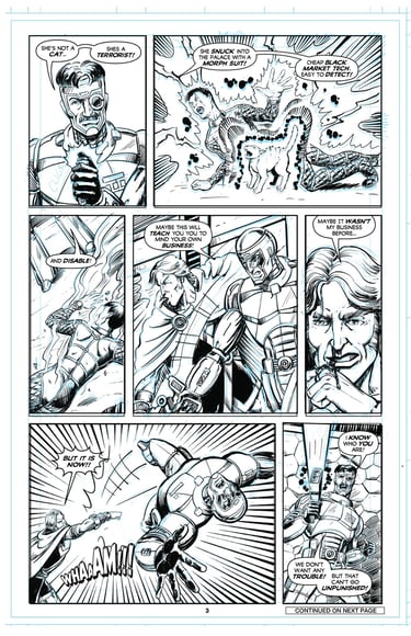
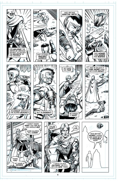
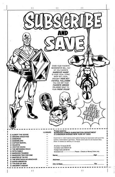
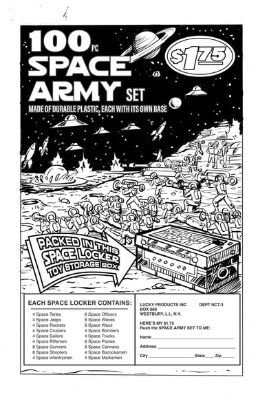
Once the script and lettering were complete, I moved on to the inking. Originally, I planned a digital/analog hybrid for the inks. I really love inking with pen and brush, and I also wanted some physical pages to show. My plan was to ink the backgrounds and other elements digitally, then print the pages on Bristol board with the underlying pencils as blue lines. That way, I could ink the remaining areas traditionally. I did this for the cover and for the Hostess, Heroes World, subscription, and toy soldier ads. However, this process was time-consuming, so for the actual story pages, I decided to ink most of the page digitally, leaving one panel and a few key figures to be inked by hand. I did this for most of the first half of the book, but it was still quite time-consuming (plus, some eye issues were making it harder to draw, and being able to zoom in digitally made things easier until the problem was corrected).
Previous: Pencils
Next: Color Guides
Eventually, I switched to fully digital inks for the second half of the book, including all the spot illustrations and corner boxes. I still printed out all the pages on Bristol board with the blue lines visible, to simulate art boards for display. The cover and full-page illustrated ads (merchandise, subscription, Hostess, and Space Army) were scanned from those boards, including the lettering.