Part One: Ideas and Inspirations
Take a look at the comics and inspirations for the 1979 styled retro sci-fi comic book The Last Abraxan.

The journey to The Last Abraxan begins in my youth, with the sci-fi comics, toys, TV shows, and movies of the 1970s. As long as I can remember, there were things like Star Trek, the Fantastic Four, Superman, Planet of the Apes, and plenty of old sci-fi movies in reruns on TV. Once Star Wars arrived, it exploded! Soon, the 1980s would become a golden age for sci-fi, fantasy, and horror across all media, ultimately leading to its dominance today.
Things weren’t quite there yet in the late 70s. They were different, smaller, embryonic, and experimental. Everyone was trying to figure out what worked and what didn’t. There was more 70s mysticism, more new age spirituality. Things like Star Wars, Star Trek, the Fantastic Four, Warlock, Starlord, Micronauts, Battlestar Galactica, and more would ultimately distill into this book. They also set me on a course that would define my life. My early desire to make my own comic books led me down a path as an artist and graphic designer. Most of my jobs and friendships have been in and around movies, TV, and comics.
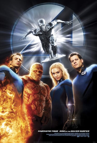
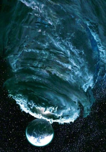
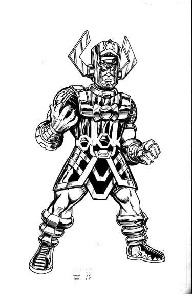
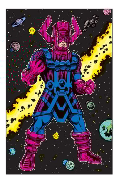
Fast forward to 2007. The superhero movie had begun its ascent into dominance as other sci-fi and fantasy franchises were waning. I was thinking about the upcoming Fantastic Four: Rise of the Silver Surfer movie. The Fantastic Four is my favorite comic, and I admit to having a fondness for the FF movies, even though they lacked the cosmic scale of the comics—comics that INVENTED the Marvel Cosmic style that I love so dearly. The movie would give us a Galactus that was a malevolent cloud, rather than the armored giant with a purple tuning-fork helmet. I decided that if they weren’t going to give me that Galactus, I would just make my own. I proceeded to do a rough pencil drawing (in my best John Byrne/John Buscema style) of Galactus. It wasn’t bad. I had recently bought my very first expensive sable-hair watercolor brush (I was primarily a pen inker) and inked the drawing. The results also weren’t bad. I decided to scan and color it as well.
While I was fluent in Photoshop, I had never really taken to modern digital coloring. I had done some small-press coloring in the 90s and early 2000s, and for a variety of marketing illustrations, but I never really enjoyed it. I wasn’t good with painterly or airbrush-style coloring, and I didn’t have any kind of tablet, so I would have to do everything with a mouse. Then it struck me: Since the drawing was in a very 70s/80s style, why not color it with the flat colors of that era, limited to 64 colors, no gradients, and minimal highlights and shadows? It played right into my weaknesses AND fit the style of the drawing. I would mimic the cyan, magenta, and yellow color percentages (25%, 50%, and 100%) and learn how to duplicate the halftone dot patterns from those old comics (this was years before Photoshop filters, templates, and custom Procreate brushes existed to do that for you).
I printed the image out on some newsprint after several unsuccessful attempts to get the flimsy paper to run through a laser printer without jamming. I was quite pleased with the end result. I would go on to do several more drawings in this style and eventually develop a painting style based on it. Old-school comic drawing became my style.
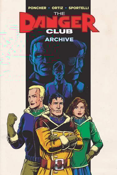
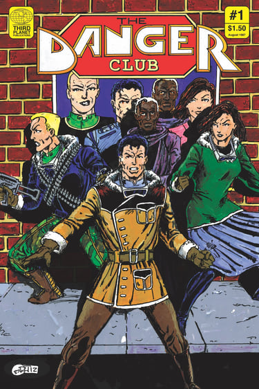
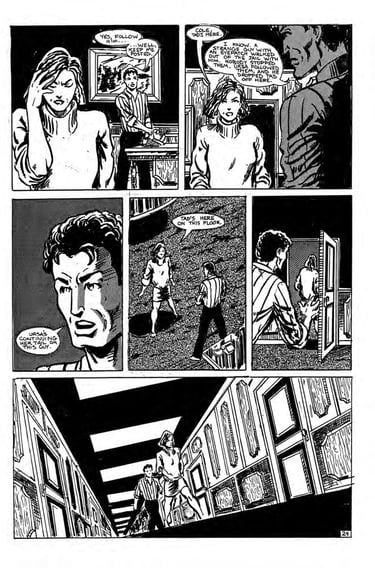
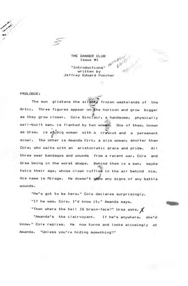
A few years later, the next step was clear. I had recently digitized some old artwork and scripts that had been deteriorating with age, including an independent black-and-white comic called The Danger Club that I had drawn back in 1986–87 but never published. I gathered all the art, scripts, and marketing materials, then turned them into a book that I printed through one of those online comic printers. I decided to take the contents of the completed first issue and create some fake ads, editorial content, and a back cover to show how it might have looked had the book ever been published. I even had a few printed on newsprint, just like a black-and-white indie comic from the late 80s. I really enjoyed seeing what could have been, as if it were an artifact from an alternate dimension where the book had actually seen print.
The last piece of the puzzle was the growing negativity in fandom. Working in the periphery of the entertainment business gave me a solid understanding of how much hard work went into making books, movies, TV shows, and comics. I thought that if fans understood that, they might be more forgiving of things that didn’t work and more appreciative of things that did. At this point, I had all the technical and creative skills to make my own comics. I was a trained artist and designer, having worked on and designed many projects, including magazines. I had also done a fair amount of creative writing over the years. Despite all this, I had never finished a comic of my own—at least not more than a couple of pages here and there, often unfinished. I decided to create a comic, every part of it, from start to finish, and document the process through a blog, posting a page at a time.
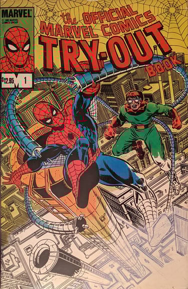
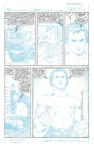
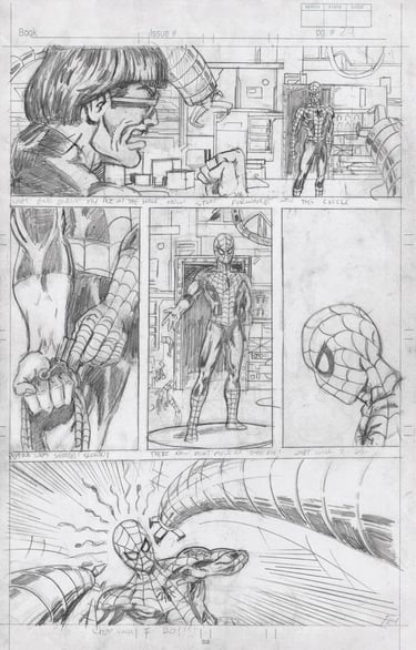
The initial plan was to finish the Marvel Try-Out Book. Released by Marvel in 1984, it featured a Spider-Man story with pages at various stages of completion, printed on professional Bristol board in blue line. It provided pages to pencil, ink, color, letter, script, and plot, along with simple instructions on the process. It was an amazing resource for many young comic artists, and they even held a contest with winners like Mark Bagley and Doug Hazelwood, who would go on to have very successful comic careers. Many aspiring creators have used the book over the years, and you can find samples of their art online if you hunt around. I owned a couple of copies of the book over the years and did many of the pages as samples. I figured I would complete it in a very period-appropriate way, with simple colors, no bleeds, thought balloons, captions, etc. I would post one page at a time, starting with the first few pages completed by the creative team. I would then complete a page, starting with the coloring section, then the inking section (which I would also color), and so on. I thought I could even take the cover and redress it as an Amazing Spider-Man Annual from 1984/85. I could include scans of the actual ad pages from an annual for that year, making the whole thing look like a complete artifact from an alternate dimension, much like my black-and-white 80s comic.
I bought a couple of copies to cut up and finish, did a lot of research on the book, and found plenty of examples of completed pages by fans and pros alike. I registered the domain marveltryoutproject.com, did some test pages, and started planning out a website. But then I realized: if I was going to do all that work and complete an entire comic book, I should just create something of my own—something I could own and actually publish.
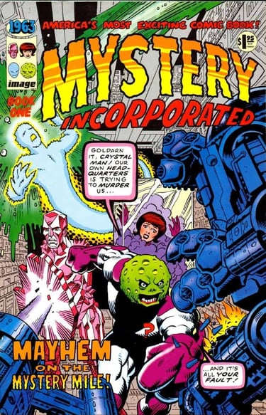
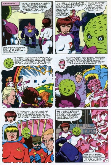
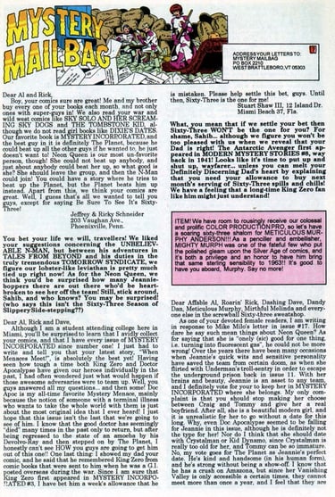
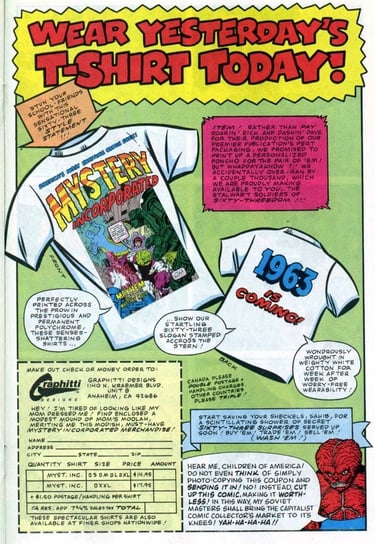
I could still keep everything else stylistically the same. It could still be done in a retro style as a fake old comic. There were several examples of this (and many more would follow). Most notably, Image Comics’ 1963, created by Alan Moore, Steve Bissette, John Totleben, Rick Veitch, Dave Gibbons, and others, was a wonderful tribute to the early Marvel Comics of their formative years. It was a very faithful version of a comic from that era, printed on newsprint and mimicking the halftone screens of old letterpress color separations rather than the finer dot screens used in comics at the time. It even featured ads and editorial content for a fictional 1960s Image Comics that never existed.
I really loved the idea of it being an artifact from another world. I decided that I wanted mine to be much the same. The letters pages, ads, and editorial would build a world in much the same way they did in old comics. I could imply a universe of other characters in the editorial and ad content, and create a whole fictional publisher loosely based on Marvel. I imagined it as a world that was close to ours, but with key differences. I found a list of the many shell companies that Marvel founder Martin Goodman published under in the 50s and 60s. The name Margood Publishing stuck out—strangely egotistical (MARtin GOODman), and not only shared a syllable with Marvel, but also with a short-lived 90s indie publisher called Good Comics, for which I had done some work. In this alternate world, Stanley Lieber wouldn’t have turned his first name into Stan Lee, but rather his last name into Lee Burr. Jacob Kurtzberg would adopt the pen name Jack Curtiss instead of Jack Kirby. Other key figures in Marvel history would be replaced with pen names or similar-sounding names. There would be web-slingers, merry mutants, Norse gods, and super soldiers—just not the ones you’re familiar with. Even the ads would mimic those from old comics, with fictional products & companies. All of this would form the framework for my comic….
Now I just had to make it...