Part Eight: Final Pages
Explore the final published pages for The Last Abraxan

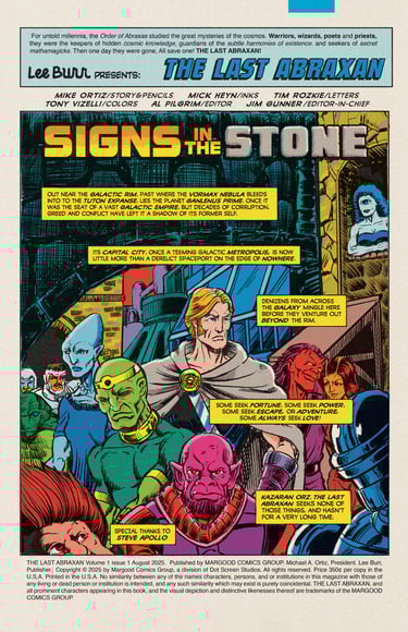
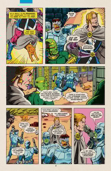
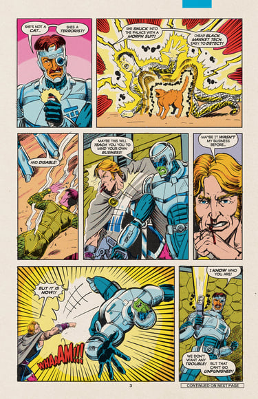
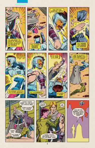
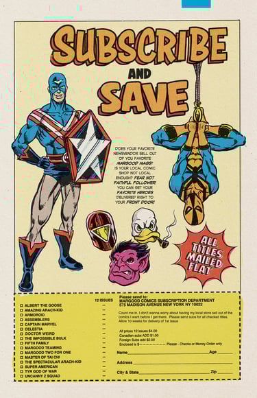
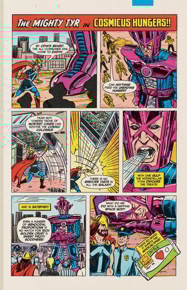
With the colors finished, it was time to tighten everything up—final corrections, a last pass at the script, and the creation of halftones for the color separations. I took the loose color guides and refined them in Photoshop, converting everything to the correct CMYK percentages. Then, I applied a halftone filter to the CMY channels to simulate the coarse dot screens of vintage letterpress newsprint comics.
To enhance the retro feel, I also added textures to replicate some of the printing imperfections typical of those archaic (and long-retired) presses. On each page, I included a colored strip that newsstands once used to determine when to pull issues from the shelves—an element not used during the period I’m referencing, but one that appeared in many of the comics I grew up with. Despite being a bit anachronistic, I added it anyway, chalking it up to multiversal discrepancies.
Previous: Color Guides
Next: Kickstarter
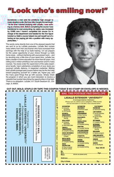
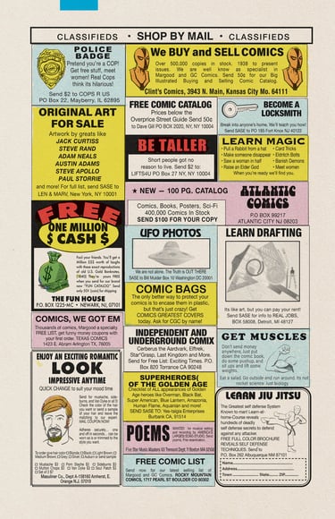
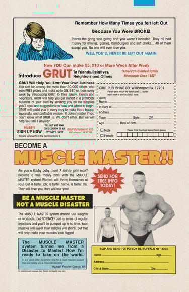
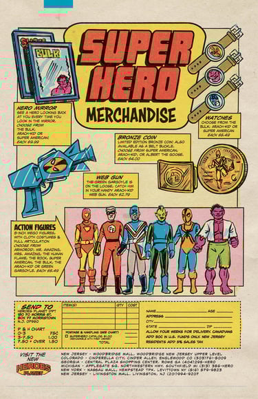
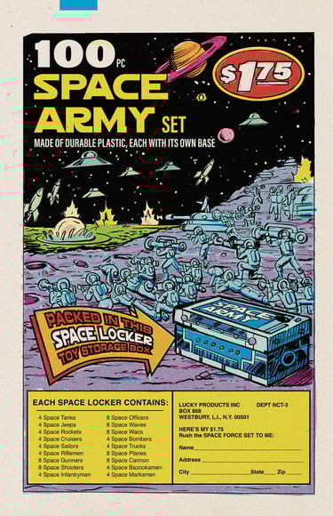
For the photography in some of the ads, I used a mix of old photos, new shots I took myself, and stock images when necessary. The final book would be printed on newsprint, but for digital versions—and this edition—I added a newsprint paper texture to maintain the look and feel of the original medium.